Thus far, I’ve only used this blog to post about Linux stuff, but I also created it to write about photography related things as well.
First of those photography related things is the X-Rite ColorChecker Passport (CCP), as I’ve had a number of people asking me about this recently.
So, what is it? Why use it? Should I buy one? Or am I just throwing away good money?
Well, to describe it as simply as possible, it’s a sort of grey card on steroids, but also much more.
One of the problems with DSLR sensors is that they all see colours just slightly differently. A particular shade of red presents differently to a Nikon D300s vs a D3200 or a D4. That same shade of red will also present just slightly differently to every other Nikon or Canon (or Hasselblad, Phase One, Pentax, whatever) DSLR.
The ColorChecker Passport allows you to calibrate & profile your camera under a given set of lighting conditions in order to ensure that your cameras is seeing colours correctly.
This happens independently of white balancing. Even when you have an accurate white balance, without calibration your colours can be a little bit off.
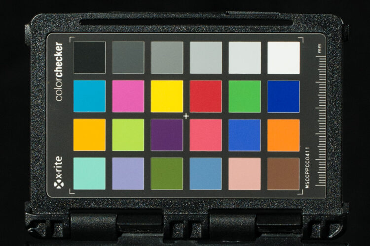
This photograph of the CCP itself, while having correct white balance, hasn’t yet been profiled. It is simply using the default “Adobe” profile that comes as part of Adobe Camera RAW as shipped with Photoshop CS5.
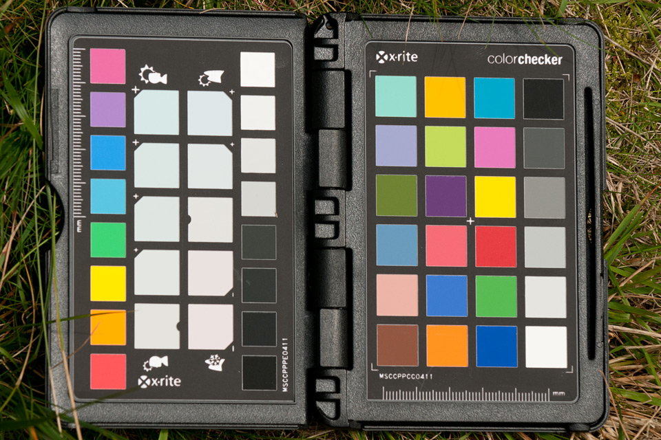
The next image is of the same photograph, with identical white balance, but this time using the calibration profile created from the RAW file of this photograph with X-Rite’s software.
The differences may not be immediately apparent, but if you look at certain squares, like that rich royal blue in the bottom right and the red a couple of squares above it, you can see the differences are there.
For most general shooting, it’s not such a huge deal. A blue sky is still a blue sky and, even if your camera doesn’t see the exact same shade of blue as that shown to your eye in reality, who’s going to know? Is the image going to be any less pleasing if the shade of blue is just slightly off? Probably not.
A decent image is still a decent image, regardless, so why bother?
Sometimes, getting colour accuracy is just that important.
If you’re doing a commercial shoot for a brand that closely guards its image and wants to ensure colour consistency throughout all their marketing literature, advertisements, brochures, signage, etc. then starting off with accurate source photography of their products and logos is going to make life a whole lot easier.
Certain fabrics can have colours that are slightly off on camera, and they may be off by different amounts in the shadows than it is in the well lit areas of the same article of clothing.
Calibrating with the CCP can make a huge difference to how those final images appear. Without calibration (or a lot of work in post), some colours can often appear too saturated, or desaturated, while other colours are the opposite.
Trying to compensate the oversaturation of one colour might desaturate another far too much, or vice versa, and the CCP brings all these in line.
I’ve also noticed it with many animals, too; Both furry and scaled.
Have you ever had somebody show you photos of their beloved pet, then say “Photos really don’t do him justice” and wondered why?
This is partially why.

With birds of prey and reptiles capable of displaying a huge array of colours and patterns, the CCP allows me to get images that truly represent natural colours of the animal.
It can also have a huge effect on flowers. They’re not something I photograph often, but when I do, it’s because they have a particular colour that appeals to me and I want to capture.
During April and May every year I hear many people complaining that they can’t get any really impressive and accurate photographs of bluebells, often turning out to be a strange purple or desaturated blue colour, and end up having to do a lot of colour correction in post to make them look the way they remember seeing them.
With the CCP, it’s all done in a couple of clicks.
Yes, the ColorChecker Passport looks kind of expensive, but it’s something that’ll sit in your bag for years and beyond initially installing the software it’s really no more of a hassle to use than a regular grey card.
The CCP is small enough that it slips in your pocket, or one of the pouches in your camera bag, and you just forget about it until you need it. Over the years it easily pays its way.
I’ve had mine for a couple of years now, and still use it on most shoots, especially when working in new lighting conditions.
If I’m shooting in natural sunlight, colours are going to present very differently than when shooting indoors with those horrible energy saving flourescent bulbs – even if the white balance is correct in both.
Different lenses may also require recalibration, too.
If I’m shooting with a 40 year old Helios 44-2 58mm f/2 lens on a given Nikon DSLR in natural sunlight, the colours and contrast it’s going to offer me will be different to a shiny new 50mm f/1.4 with it’s optically superior glass and modern lens coatings, even when used with the same body under the same light.
So, as with calibrating a printer, where you need to do it for each type of ink & paper you use, you should also do the same when calibrating your camera. You (ideally) need to do it for each different lens & lighting scenario.
Bright unhindered direct sunlight will present differently to the light from a cloudy sky. It will also present differently from a Nikon SB-900 speedlight, as it will from a Bowens Gemini 500 studio strobe.
Depending on how strongly you feel about colour accuracy, you may also want to do it for each key light modifier you use.
As well as different flash light sources presenting differently when bare (Bowens Gemini 500 vs Nikon SB-900, for example), putting them inside modifiers also changes them.
Even if you only own one modifier, putting a Gemini 500 inside it will give you a slightly different spectrum of light than you’d get if you put an SB-900 inside it.
Fortunately, you only have to do this for a given combination once, and then it’s done. Whenever you shoot with that same combination of equipment in the future, you can always refer back to that original calibration profile.
Is it worth getting one? Is it worth using one? Is it really worth spending all that money to get it?
Personally, I say yes. For me, it definitely is. Even if I’m going to drastically alter the original colours of a photograph in post, having an accurate base image to start with makes the process go much more quickly and smoothly.
I’ve had it for a couple of years so far, and I imagine I’ll still be using it a decade or more from now. That puts its total cost about £5/yr. Not so expensive when you look at it that way.
For you, it may not be. It all really depends on what you want to get out of your equipment, how important accuracy is to you, what other software you’re using (the software only really works with Lightroom & Adobe Camera RAW).
Update: For you video guys, the ColorChecker Passport is now natively supported in DaVinci Resolve 11.
I plan on doing at least one more post on the ColorChecker Passport, to show how to use the thing, so subscribe to the RSS feed, or follow the Facebook page if you’re interested in keeping updated.